People, Not Feeds
How to move from addictive design to connective design

I have so many thoughts about social feeds that I've wanted to write down for a while, and they might feel a bit spicy given the current trend of custom feeds, starter packs, etc. Building on the fantastic "People, Not XYZ" discussions that folks have been having as they build the next generation of social tools and platforms, I submit a new entry: People, not feeds.
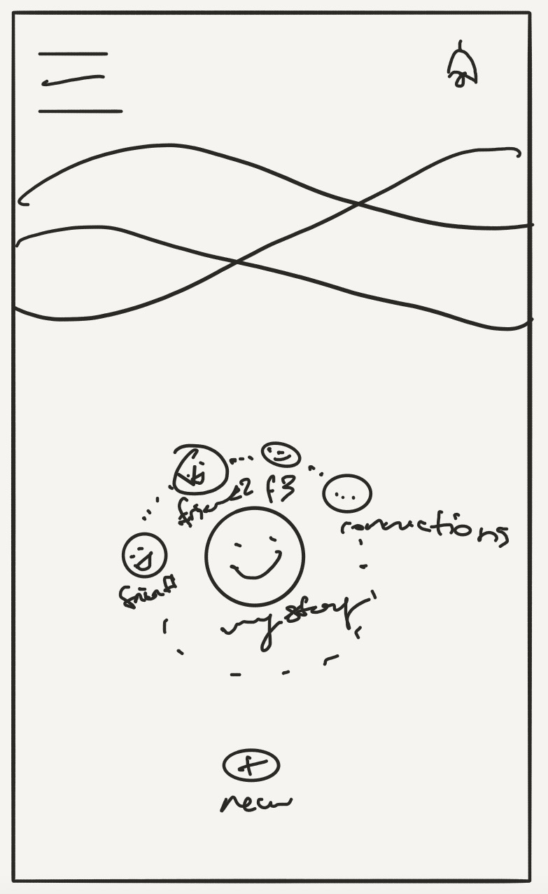
I'm definitely not the only one having these thoughts: Anuj is working to build catsup, a client for bsky/atproto that eschews feeds and gives you just your list of people who you can click on to see their updates. Mastodon client phanpy has a wonderful view (albeit not the default, and it has to scrape the feeds to construct it) called catch-up that shows the people who have recently posted and lets you click on their profile photo to see a list of their updates in the time period you choose. My very first concept drawings of frequency from waaaay back in 2018 featured a home screen with the faces of your few closest connections that showed when they had an update, and then updates from the rest of your connections were tucked away on another page:

There's a good reason we're all circling around the same concept: feeds weren't built for connection. They were built for infinite consumption. They are little slot machines of content. Sometimes when you scroll, you get something good. The next scroll, nothing interesting, so you try again. But either way, you keep scrolling. And for the ad-supported platforms that invented them, this is what they want, because they can insert an ad in each scroll. They perfected the fine art of figuring out exactly which kind of post will be interesting to you and showing it to you at just the moment that you might have stopped scrolling and closed the app. I went way more into how these manipulative design work and why we're so vulnerable to them in my last two posts, You vs. 1000 Engineers and Beyond the Digital Detox, so I'll keep it brief here.
But despite the greedy motivations of the ad-supported platforms around their algorithm design, some of the original reasons for these sort of algorithms were pro-social: the main one being to surface posts from our connections who might not post as frequently and could get buried under the more prolific posters. The problem is that this motivation didn't stay as the central goal of the algorithm; the motivation to show as many ads as possible was also mixed in, and over time that goal was dialed up more and more.
The Fix?
The prevailing argument I've seen to fix this is to just have chronological feeds instead. Or allow users to control what appears in the feeds. And many apps have tried this. But I think this is misdiagnosing the issue slightly. Yes, an algorithm tuned to serve you upsetting content to keep you scrolling is part of the problem. But just removing it and keeping the addictive, slot-machine-style design of the infinite feed doesn't instantly fix everything. We've been trained to scroll endlessly by these algorithms. When we see the same mechanism, no matter whether the algorithm behind it is an engagement maximizing one or a chronological one, we behave the same way.
If someone were truly designing something to encourage connection, I think that they would come up with something different than a feed. Feeds are data streams; they're meant to contain lots and lots of information at a glance. Just think about it: if you want to catch up with a good friend, do you meet them in the middle of a crowded town square where everyone is shouting about their cause, or do you meet them at a quiet coffee shop? Do you invite along another friend so that they can keep butting in with their own updates to pull focus away from the person you're trying to catch up with? Obviously, not. That would be absurd. But that's what our feeds are doing. We go there to connect, but they pull us in all of these different directions and scatter our attention from the relationships that matter most. No wonder so many people are retreating back to private chats.
Now that's not to say there should be no feeds at all; they are a decent choice for the town square use case. But a lot of us signed up for platforms like facebook and instagram back in the day to connect with our friends and family, and slowly got the global town square injected into our once-intimate experience.
A Different Approach
It doesn't have to stay this way. We can experiment and try new things! I have been working on my own non-feed design for frequency. It shows you the people you care about most centrally, with others a little further away. When they've posted something new, you'll see a subtle visual indication and you can tap to see their recent updates - just them; no one else. Check out the latest evolution of this design below:

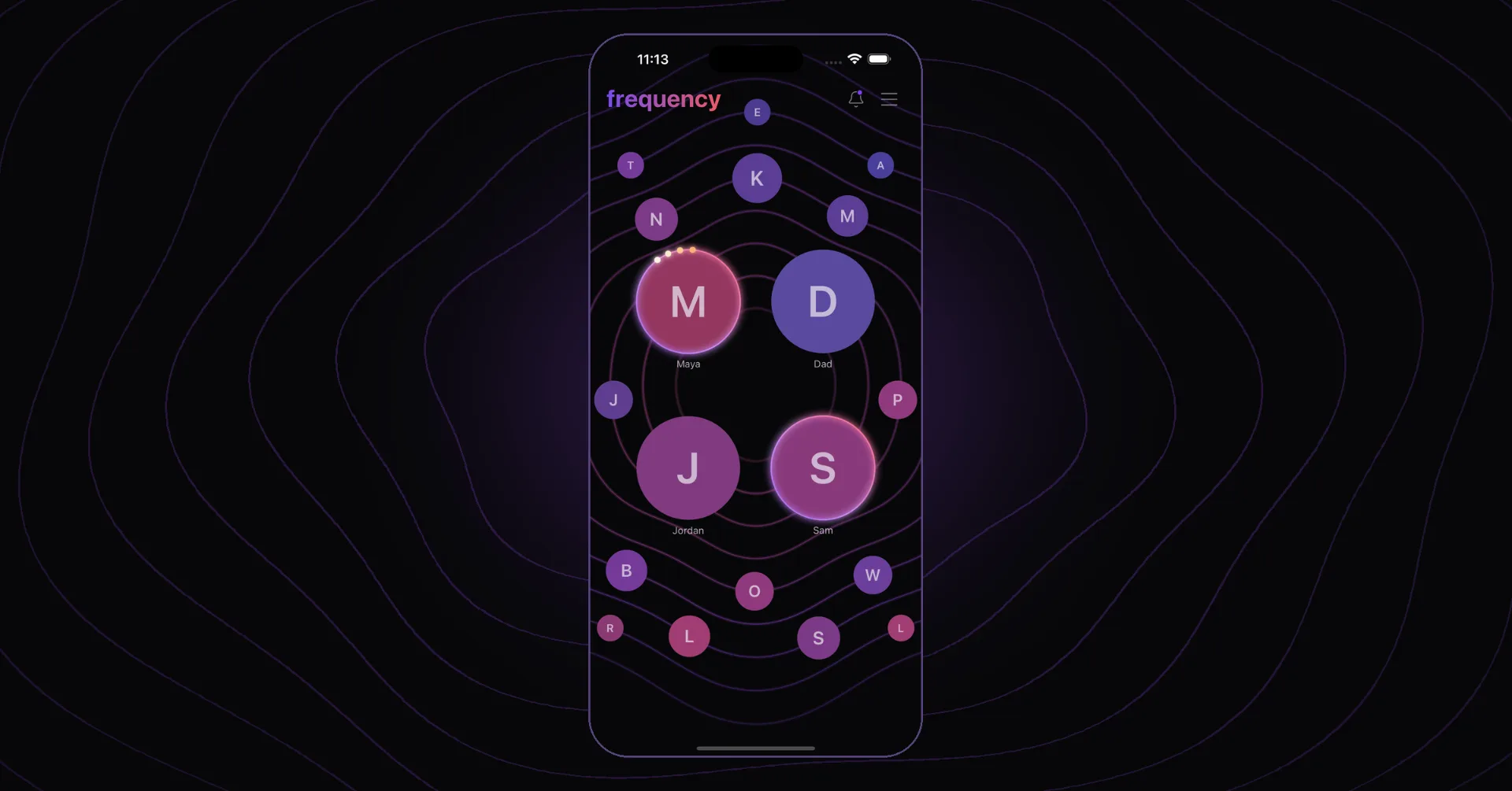
I hope that this design, combined with frequency's private accounts and two-way connections instead of followers, enables us to go back to a time of posting social updates and having profiles while allowing more focused connection. I want anyone who has opted out of addictive social apps to have an option that supports their needs.
If you're interested in checking it out, sign up for the waitlist. We'll be launching once private spaces are available on atproto. If you'd like to participate in some research or alpha test, reach out to me at Jesse Karmani.