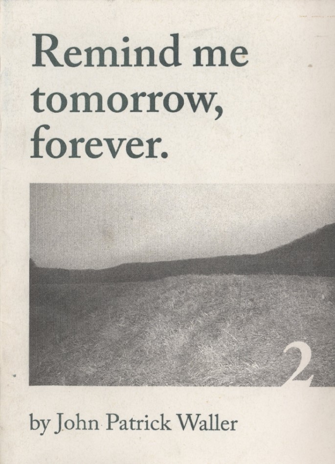
"Remind Me Tomorrow, Forever - Vol. 2" by John Patrick Waller


I picked up this publication at the Northampton artist book / zine fest in 2017 or 2018, back when it was being held at the A.P.E space on Main St. "Remind Me Tomorrow, Forever" is a very slim riso printed photobook, part of a series of 6 publications of which I own none other. It has sat in my collection for a while holding a strange space, because while I think it's not very good and at the time I felt like I spent too much money on something that felt a little low effort, the centerfold full bleed print has with some time taken on a sonorous quality. It's lovely, and a frequent flier of one of my bookstands for display on a shelf or bookcase, but it took a while for it to get its hooks into the part of my brain that gets hung up on a particular photograph or illustration. Here it is, under these words.

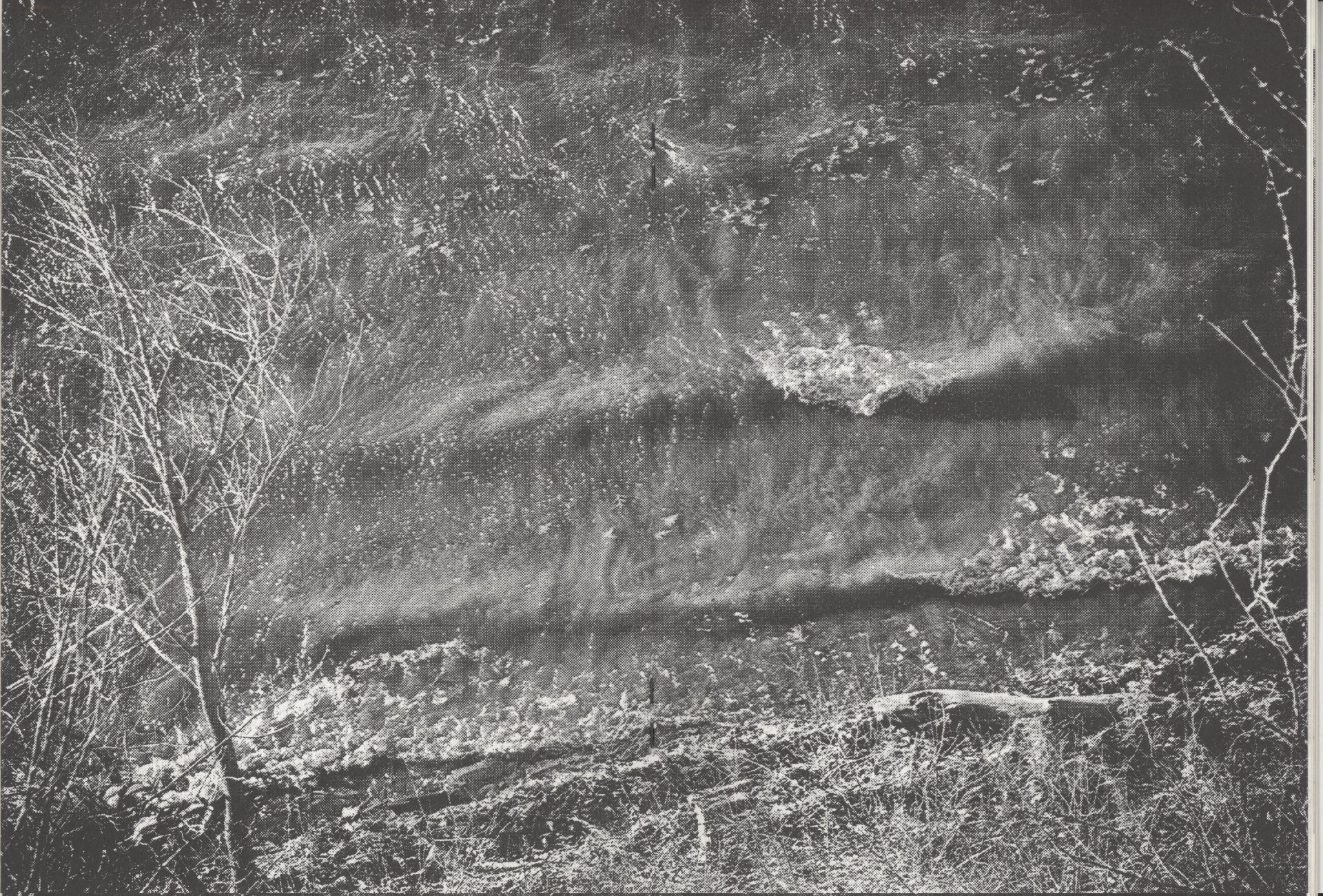
It's an image that hurts my brain a little. The perspective seems so strange. It has the dreamlike quality of a Daisuke Yokota print, like a composite image, but it's as simple as photographing a beach or the edge of a river from the top of a cliff or other vantage, with the fallen tree providing the skewed sense of dimension. It's not an image that stood out to me until I dug it out of my collection again in 2021, when I was photographing water in streams and canals and riparian zones and saw the same little spark of recognition that was motivating me, and then later again I thought about it in connection with the photographs of Joe Deal whose aesthetic intrigue involves the same simple shift in perspective, of looking for a high point and shooting down and eliminating the horizon line. I rant like this because I've actually thought about this picture a lot, but I didn't see any value in it when I first bought it. I thought the riso-printing was a bit of a gimmick and the remaining content of the zine felt like scrap photos assembled for no particular reason. There's a lesson here.

I've tabled at a few zine fests and there's a particular type of person I'll label as The Enemy. The Enemy floats past every table, and flips through every page of the displays you've brought with you, then having in their minds consumed every millimeter of your work, smiles at you and then walks away. The logic I recognize here is someone looking to see if they'll get their moneys worth, if it's a worthwhile purchase, when art doesn't work like that. Zines and photobooks are a poor investment for entertainment value. They don't entrance you for very long, for twice or three times the cost of an album or a movie ticket you might sit down and digest it in all of ten minutes and then throw it in a suitcase and never see it again. In 2018 I definitely thought I paid too much money for this, but I was really really into black and white photography and so bought it sight unseen, and years later it's still taking up real estate in my mind. So when I go to these fairs as a buyer I don't worry too much about thinking twice. If something catches your eye, just buy it! You never know what little scrap may take on a diamond quality years later!
_________________________________________________________________________________________________
I don't want to be too unfair to the artist. I don't have the full collection of these little zines and so don't know the whole context for this project! The teeny design element of the "2" occluding into the cover photo is also a v. tasteful little touch. I used writing this as an occasion to check out his other work for the first time and his portfolios are really quite lovely and worth taking a gander at -> https://www.pushbutton.pictures/
No full scan this time, sorry! I am respecting the itty bitty (c) symbol when it appears